In theory, websites should be like humans: unique, both visually and content wise. Practice shows us that it is quite hard to achieve the ultimate level of 'uniqueness' when niche areas are more and more narrow and popular domains of activity are extremely competitive. Developing a Joomla Auction Website is a fun and lucrative activity, but as for any Joomla Website - there is always the question "What Template should I use"
The online auction scene hosts thousands of websites, some extremely popular, others relying on a more local exposure. We have selected a few of the most popular ones to talk about their style, layout and overall vibes, and propose a Template that would match that style. Here is what we found:
 | Ebay has been for years the standard in online Auctions. They have reviewed their looks several times, for better of for worse (depending who you listen to :)
- the white background is a classic choice to make the products stand out and the homepage welcomes a new visitor with a pleasant richness of color and variety;
- it is easy to navigate throughout the categories, as they are presented in tabs, under the search bar, for quick access;
- as the visitor further explores the available auctions seeking for a specific product (for instance a GoPro camera), he will notice that the refined list contains details such as the number of views per day, set starting price, whether it's a Buy-it-Now auction or not, number of items remaining in stock, etc. Layout is clean, the picture quality is generally high and the page speed test indicates a grade of 97/100.
|
 | Alibaba Group is China's largest e-commerce company. The website started early in 1999 and is now one of the largest eCommerce websites in the world
- with a 16 year reputation within the global wholesale market, Alibaba is extremely versatile and well organized;
- the category list is available on the left side of the homepage with an extensive subcategory menu; also, the search bar offers a practical filtering system either by products, buyers or sellers, for a more efficient navigation;
- a nice touch is given by the Hot Products slider at the bottom of the page, for bidders who simply want to obtain a good deal, regardless of the nature or functionality of the product.
|
 | The USA based company - uBid has one of the oldest Auction Websites around, has a more consumer electronics focus, and was once the second player in the online auction business
- the signature logo sends out fresh, dynamic vibes through the usage of green tones and a witty slogan "Where you win at paying less", however the presence of the social media buttons on the top right side of the page could strike as cluttering for some visitors, as the buttons are also visible at the bottom of the page, along with the other relevant information about contact, login, signup, etc.;
- the homepage design nice and fluid, making it easy to browse through categories and the horizontal slider presenting the auctions that will be closing soon is a major focus point for experienced online bidders;
- the product detail page is quite straightforward, with elaborate information on the item in question and also with a small, 4 thumbnail gallery of related products, to offer the bidder a reinforced feeling of making an educated choice.
Template to give your website the uBid flavor: Template #002053 |
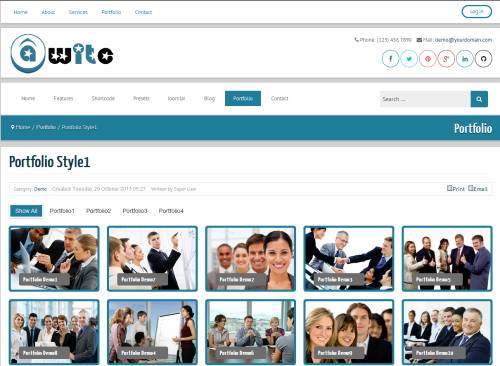
 | OnlineAuction (or Ola.com) is a seller-friendly website that focuses on cutting the cost for the powersellers. With a fresh and clean look - it is one of the top sites out there.
- judging by the bold counter set on the right of the homepage, over $662.200.000 are listed in active auctions, which gives the new visitor a sense of confidence that the website is alive and kicking;
- the horizontal sliders display featured auctions from mostly all the categories, followed by horizontal listings of hot auctions, the ones which are ending soon, as well as the recently listed ones,resulting in quite a neat layout!
- the product pages include generous descriptions,a real-time availability counter, bidding information and other details such as shipping and payment methods, all wrapped in a light, classic design.
Template to give your website the OnlineAuction.com flavor: Awite |
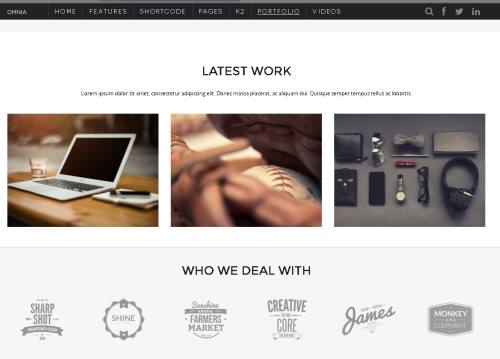
 | eBid.net is a UK based auction website that offers a large number of local sub-sites for Europe, America and Asia. It has a clean and user friendly look and claims to have lower fees then their main competitors
- coming in strong as eBay's main competitor, eBid uses a very modern, responsive template that welcomes any newcomer with a colorful display;
- the marketing pop-up on why should a user choose eBid over eBay offers a nice touch and reinforces the site's popularity and commitment towards quality and excellent product delivery;
- on each product page, the Meet The Seller module stands out by its simplicity and elegance, thus making it easy for buyers to make an educated decision about which product to bid for, according to the seller's feedback score, membership age and so on.
Template to give your website the eBid flavor: Omnia |
Please note that the out-of-the-box templates do not 100% replicate the exact layout of the above mentioned auction sites and regardless of provider, they will still need some customization for ideal results!


