We always advise our customers to keep their site clean, so that the visitor can have a pleasant experience given by an intuitive workflow, which is easy to find and well presented. For the last couple of years we have given our feedback also to the Joomla! Community for the official pages, but it was not taken under consideration. Now, a couple of years after the implementation of the new extension directory of Joomla! (JED), the only positive change is the improvement of the category page. Hopefully for Joomla!, the long expected changes aren't coming too late.
Unfortunately, in my personal opinion, the user experience on the Joomla! extension site (JED) heavily contributed in the loss of market Joomla! has encountered in the last period of time. As main flaws of the site I noticed a lack of user experience, confusing layout, extremely crowded design and repetitive functions which may scare new users away.
Based on the screenshots, I'll try below to present some points, where there is a lot of room for improvement.
1. Menu Items.
There are a lot of repetitive menu items, making the whole menu structure of the site unclear and heavily confusing for a new user, who barely discovered the Joomla! CMS. Also, some menu items like the ones circled in light blue are only crowding the space since all this information can be structured together and presented in a friendlier manner to a Joomla! newbie.
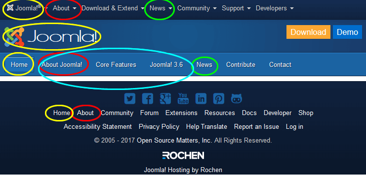
A short note here regarding the footer: I think that there is plenty of commercial space available for the Rochen services on the other Joomla! pages, was it really needed to put this permanently on the Joomla footer too? I do not know, but this caught my attention, since it is one of the fewest large open source communities that is displaying a commercial on all the pages in their footer.
2. Lack of direct important links: Templates, Extensions.
This links are the core of the Community, vital for the new Joomla User. Without the templates and extensions Joomla is just an article management system, and the Community is lost. The main reason the Joomla! evolved so much after the Mambo downfall, was the Community formed from and around template and extension developers, which developed at a fast pace, attracting so many new users, by offering plenty of visual layout choices and functionalities.
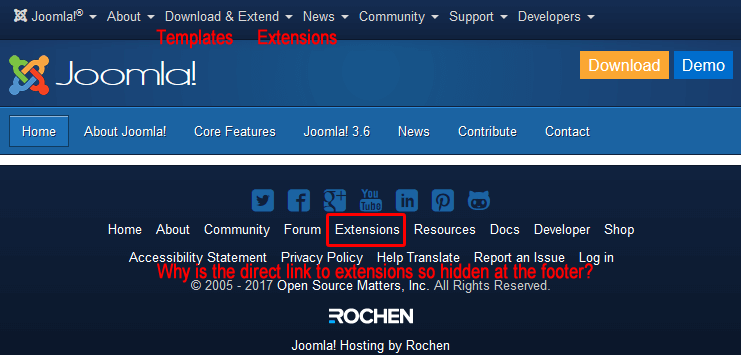
The only direct link is barely noticeable at the footer, after the user has been bombarded with tons of information. That direct link is available here and only for the extension site, missing a template directory.
3. Repetitive functions.
Why clutter the layout with redundant functions?! If the layout is clean, the users can find much faster their way around the website, instead of a bulky layout, where they have to search much more through all the presented information, to find what they actually need.
As an example (for points 1-3), I can present here the Wordpress.org structure, NOT because Wordpress is a better CMS than Joomla!, but only because of their clean presentation layout which is vital for such a Community oriented website. Just have a look at Google.com, which actually has all the information in the world, yet they avoid hammering that into your face, and have not changed their initial neat and clean look, providing a pleasant user experience.

4. Category page on JED.
We are glad to see this has just been improved recently; too bad it took years to change the extremely confusing look that it had. Just thinking about that mouseover effect still makes my skin crawl. We tried to signal the issues, even from the very beginning (couple of years ago) with no avail. The new page provides a better experience also on mobile devices in comparison to the old one, but there is still room for improvement - layout, structure, redundancy - and weirdly even the counters seem not to work properly.
5. Listing page on JED.
Unfortunately, the newly introduced changes did not extend further then the category page. The extension listing page is still confusing and reminds me of the old category page, which is not usable on mobile devices. A short description of each item is presented only at mouse over, which is not available on mobile devices (and truth be told it's a rather outdated web function). The short extension description should be visible from the start, helping users to make a better selection of the potentially needed item, selection process not being based solely on a picture and a title. And honestly - would you expect the user to click on every extension in order to read the brief description?
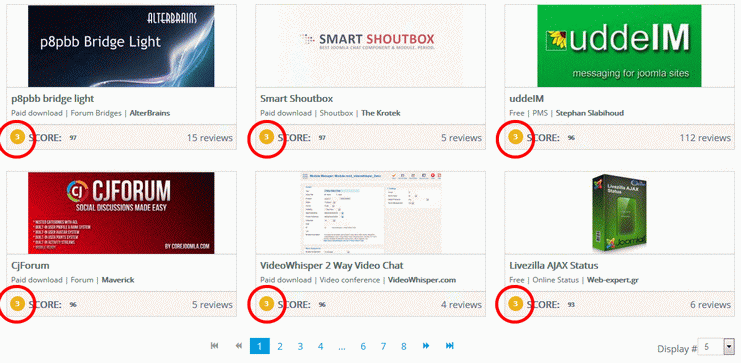
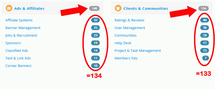
There is also a fair amount of unnecessary information on this page (which is crowded anyway by the items themselves) like the circled 3 (representing the Joomla! 3.x version). This is not necessary on this page since for some time older compatibility versions were dumped from JED. This "3" can be misleading for a new visitor, making them think it's a rating (and honestly it tricks me too half of the time). It will be enough to present the compatibility versions on the extension detail page.
6. Extension detail page on JED.
The word "introduction" seems to be held at high respect (which BTW is as big as the title) - It should be removed; it's quite clear and intuitive that the text below is a short description. Category tags should be placed in a lower page position, since the user already knows what type of extension he accessed and the first thing he would rather read is the short description.
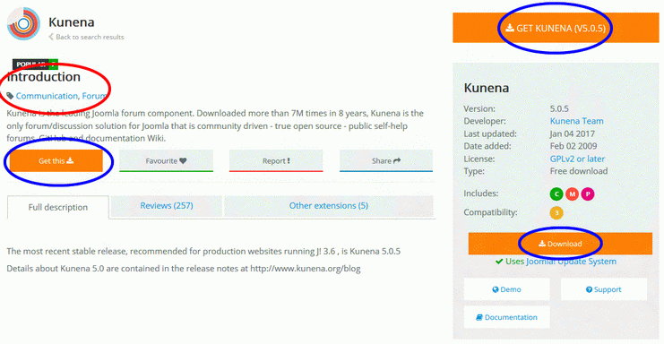
Again here, the same mistake of having 3 buttons with the same purpose, taking up space and cluttering the page, lacking to provide a clean, intuitive layout. And don't make me start about the "ratings wheel" - what is wrong with clean "rating stars" as we see in all major websites? Who expects a new Joomla user to understand a set of weirdly colored circles? Nobody wondered why huge websites that rely on the ratings system still use a simple star rating ? Just have a look at Apple's Appstore, Google Play or Steam (which has an even simpler thumbs up - thumbs down ratings system)
7. Reviews on JED.
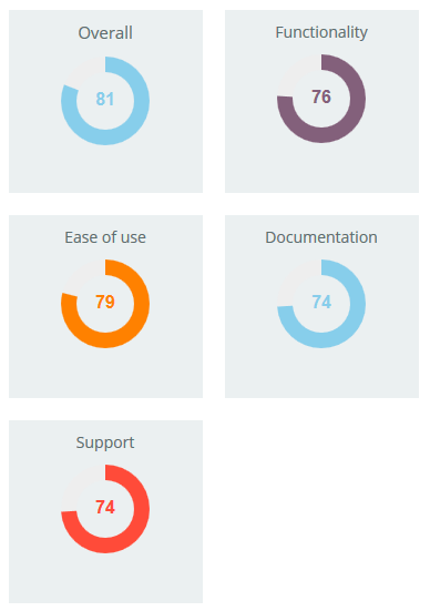
Since we developed extensions from the beginning of Joomla!, we noticed from our experience and from other developers, that a satisfied user does not rush with joy to JED in order to post a positive review. You have to kindly ask him. Of course, any slightly disgruntled customer goes straight ahead to bash your work. Many reviews are only revenge reviews, which are not serving the Community in a productive way. It's even worse after posting a rating has become so complicated, that instead of asking a simple general note (sometimes a "it's working as intended" is the most helpful rating there is), it's asking for a whole lot of information that would scare any well intended customer away. Who has in our days the time to write an literary essay when posting a review? Also the fragmentation of the rating is totally useless - I mean there is no search after the best support or the best documentation, everything is still related to a general score. And - what does a 75% of a "FUNCTIONALITY RATING" even mean? is the extension broken? is it working just 75% ??
Perhaps the Joomla! community will manage to implement some of our ideas; if not, we wanted to at least present this also as a case study to our customers, to help them create a better layout for their site, taking under consideration primarily the site visitor and its experience. It is very important to define the needs of the site, depending on the main visitor's goal. Create a hierarchy of priorities for the user and therefore the site structure. Keep it as clean as possible and intuitive, taking under consideration today's web standards and how the visitors are accustomed to their general experience with the World Wide Web.
Erik Folberth
Project Manager